WeBWorK Problems

Disabling red/green indicator bars

Disabling red/green indicator bars

by Steven Fiedler -
Number of replies: 4

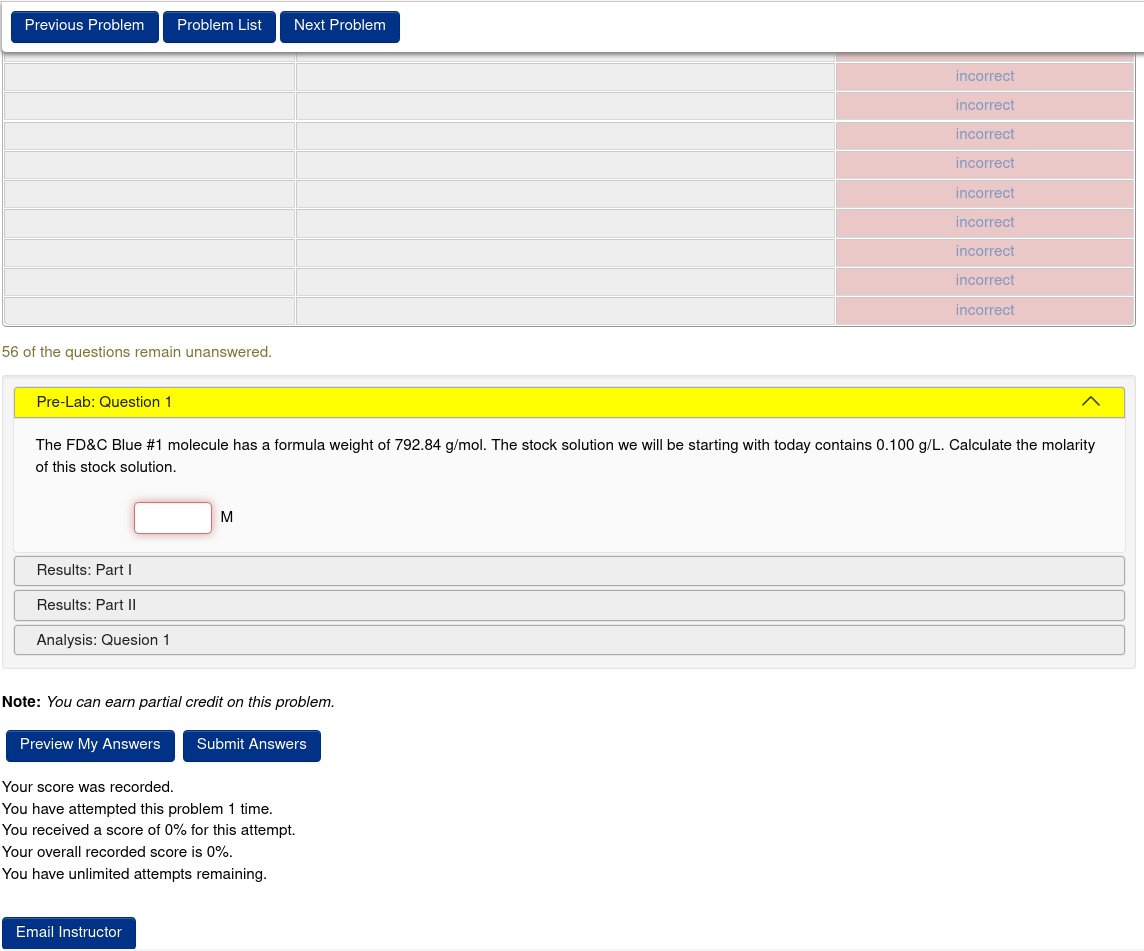
I’d like to determine if it possible to suppress the red/green indicator bars for regular (i.e., non-Gateway) homework assignments. Attached is a picture for one such use case. The default behavior of scaffold problems appears to display the bars for all sections, even for those that have yet to be opened. As shown, these tend to proliferate for problems that require multiple student responses.

Scaffold problem with muliple indicators

In reply to Steven Fiedler

Re: Disabling red/green indicator bars

by Glenn Rice -

This is the design of the scaffold.pl macro.  This can be changed, but requires you to use a custom version of the scaffold.pl macro.

Change line 471 of scaffold.pl (the line number may be different if you are not using PG 2.16) from

    my @styles = (map {".attemptResults > tbody > tr:nth-child($_) {opacity:.5}"} @hide);

to

    my @styles = (map {".attemptResults > tbody > tr:nth-child($_) {display:none}"} @hide);

Place the modified scaffold.pl file in your course's macro directory.

Note that this will probably not quite work the way you want.  When a new section first opens its rows in the results table will still appear and be marked as incorrect.  There is no way to change this at this point.  The scaffold.pl macro has no valid way of distinguishing between the case that the section is first opened and the case that it was open and is incorrect.

In reply to Glenn Rice

Re: Disabling red/green indicator bars

by Steven Fiedler -
Thank you.  After implementing Glenn's recommended change, I made additional headway on eliminating the red/green indicator bars by replacing line 458 in scaffold.pl from
      my %show; map {$show{$_} = 1} @_;
to
      my %show; map {$show{$_} = 0} @_;

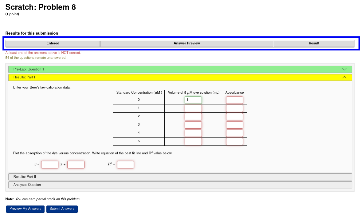
This completely removes the set of red/green results bars, but unfortunately the header row remains intact.  A blue box in the attached screenshot displays this region.  I would appreciate any additional suggestions for cleaning this up and removing this row as well. 


Attachment screenshot.png
In reply to Steven Fiedler

Re: Disabling red/green indicator bars

by Robert Mařík -
What about to remove the table with some css which is just for this problem?

ADD_CSS_FILE("css/myfile.css");
In reply to Steven Fiedler

Re: Disabling red/green indicator bars

by Davide Cervone -

You may want to reconsider removing the lines entirely. That table can give important information to the student, like pointing out syntax errors or messages about using the wrong type of answer (a formula instead of a number), and other such details. If you remove the table like you have, that information will not be available to the student.

If you are trying to reduce the number of lines, you could consider using a MultiAnswer object to handle the table (or one per line of the table) with singleResult => 1. You could still organize the student and correct answers as an array in the results table, if you like, but there would only be one row in the table. But removing the table entirely is probably not a good idea.

Also, if you use a modified version of scaffold.pl, that will be used for ALL scaffold problems that you assign, so you might want to rename the macro file and load it by the modified name, so your changes don't interfere with other scaffold problems (and if you contribute your problems to the public library, along with your modified scaffold code, it can be used by others with the output you intend).